Namespace Google.Apis.HangoutsChat.v1.Data
Classes
AccessPermissionSetting
An access permission setting.
AccessPermissionSettings
Access permission settings for a space.
AccessSettings
Represents the access setting of the space.
AccessoryWidget
One or more interactive widgets that appear at the bottom of a message. For details, see Add interactive widgets at the bottom of a message.
ActionParameter
List of string parameters to supply when the action method is invoked. For example, consider three snooze
buttons: snooze now, snooze one day, snooze next week. You might use action method = snooze(), passing the
snooze type and snooze time in the list of string parameters.
ActionResponse
Parameters that a Chat app can use to configure how its response is posted.
ActionStatus
Represents the status for a request to either invoke or submit a dialog.
Annotation
Output only. Annotations can be associated with the plain-text body of the message or with chips that link to
Google Workspace resources like Google Docs or Sheets with start_index and length of 0. To add basic
formatting to a text message, see Format text
messages. Example plain-text message body:
Hello @FooBot how are you!"
The corresponding annotations metadata:
"annotations":[{
"type":"USER_MENTION", "startIndex":6, "length":7, "userMention": { "user": { "name":"users/{user}",
"displayName":"FooBot", "avatarUrl":"https://goo.gl/aeDtrS", "type":"BOT" }, "type":"MENTION" } }]
AppCommandMetadata
Metadata about a Chat app command.
AttachedGif
A GIF image that's specified by a URL.
Attachment
An attachment in Google Chat.
AttachmentDataRef
A reference to the attachment data.
Audience
A target audience in Google Chat. A target audience represents a group of users within a Google Workspace organization, defined by an administrator. Target audiences are used to configure access and visibility settings for resources, such as making a space discoverable to a specific group of users. For more details, see Target audiences and Make a space discoverable to a target audience.
Availability
Represents a user's current availability information in Google Chat, including their state (for example, Active, Away, Do Not Disturb) and any custom status.
Button
A button. Can be a text button or an image button.
CalendarEventLinkData
Data for Calendar event links.
Card
A card is a UI element that can contain UI widgets such as text and images.
CardAction
A card action is the action associated with the card. For an invoice card, a typical action would be: delete invoice, email invoice or open the invoice in browser. Not supported by Google Chat apps.
CardHeader
CardWithId
A card in a Google Chat message. Chat apps can create cards with app authentication. As part of the Developer Preview Program, if your Chat app authenticates as a user, it can create card messages. If your Chat app is not part of Developer Preview Program, it can't create cards with user authentication. To learn how to create a message that contains cards, see Send a message. Card builder
ChatAppLogEntry
JSON payload of error messages. If the Cloud Logging API is enabled, these error messages are logged to Google Cloud Logging.
ChatClientDataSourceMarkup
For a SelectionInput widget that uses a multiselect menu, a data source from Google Chat. The data source
populates selection items for the multiselect menu. For example, a user can select Google Chat spaces that
they're a member of. Google Chat apps:
ChatSpaceLinkData
Data for Chat space links.
Color
Represents a color in the RGBA color space. This representation is designed for simplicity of conversion to and
from color representations in various languages over compactness. For example, the fields of this representation
can be trivially provided to the constructor of java.awt.Color in Java; it can also be trivially provided to
UIColor's +colorWithRed:green:blue:alpha method in iOS; and, with just a little work, it can be easily
formatted into a CSS rgba() string in JavaScript. This reference page doesn't have information about the
absolute color space that should be used to interpret the RGB value—for example, sRGB, Adobe RGB, DCI-P3, and
BT.2020. By default, applications should assume the sRGB color space. When color equality needs to be decided,
implementations, unless documented otherwise, treat two colors as equal if all their red, green, blue, and alpha
values each differ by at most 1e-5. Example (Java): import com.google.type.Color; // ... public static
java.awt.Color fromProto(Color protocolor) { float alpha = protocolor.hasAlpha() ?
protocolor.getAlpha().getValue() : 1.0; return new java.awt.Color( protocolor.getRed(), protocolor.getGreen(),
protocolor.getBlue(), alpha); } public static Color toProto(java.awt.Color color) { float red = (float)
color.getRed(); float green = (float) color.getGreen(); float blue = (float) color.getBlue(); float denominator
= 255.0; Color.Builder resultBuilder = Color .newBuilder() .setRed(red / denominator) .setGreen(green /
denominator) .setBlue(blue / denominator); int alpha = color.getAlpha(); if (alpha != 255) { result.setAlpha(
FloatValue .newBuilder() .setValue(((float) alpha) / denominator) .build()); } return resultBuilder.build(); }
// ... Example (iOS / Obj-C): // ... static UIColor* fromProto(Color* protocolor) { float red = [protocolor
red]; float green = [protocolor green]; float blue = [protocolor blue]; FloatValue* alpha_wrapper = [protocolor
alpha]; float alpha = 1.0; if (alpha_wrapper != nil) { alpha = [alpha_wrapper value]; } return [UIColor
colorWithRed:red green:green blue:blue alpha:alpha]; } static Color* toProto(UIColor* color) { CGFloat red,
green, blue, alpha; if (![color getRed:&red green:&green blue:&blue
alpha:&alpha]) { return nil; } Color* result = [[Color alloc] init]; [result setRed:red]; [result
setGreen:green]; [result setBlue:blue]; if (alpha <= 0.9999) { [result
setAlpha:floatWrapperWithValue(alpha)]; } [result autorelease]; return result; } // ... Example (JavaScript): //
... var protoToCssColor = function(rgb_color) { var redFrac = rgb_color.red || 0.0; var greenFrac =
rgb_color.green || 0.0; var blueFrac = rgb_color.blue || 0.0; var red = Math.floor(redFrac * 255); var green =
Math.floor(greenFrac * 255); var blue = Math.floor(blueFrac * 255); if (!('alpha' in rgb_color)) { return
rgbToCssColor(red, green, blue); } var alphaFrac = rgb_color.alpha.value || 0.0; var rgbParams = [red, green,
blue].join(','); return ['rgba(', rgbParams, ',', alphaFrac, ')'].join(''); }; var rgbToCssColor = function(red,
green, blue) { var rgbNumber = new Number((red << 16) | (green << 8) | blue); var
hexString = rgbNumber.toString(16); var missingZeros = 6 - hexString.length; var resultBuilder = ['#']; for (var
i = 0; i < missingZeros; i++) { resultBuilder.push('0'); } resultBuilder.push(hexString); return
resultBuilder.join(''); }; // ...
CommonEventObject
The common event object is the portion of the overall event object that carries general, host-independent
information to the add-on from the user's client. This information includes details such as the user's locale,
host app, and platform. In addition to homepage and contextual triggers, add-ons construct and pass event
objects to action callback
functions when the user
interacts with widgets. Your add-on's callback function can query the common event object to determine the
contents of open widgets in the user's client. For example, your add-on can locate the text a user has entered
into a TextInput widget in the
eventObject.commentEventObject.formInputs object. For Chat apps, the name of the function that the user
invoked when interacting with a widget.
CompleteImportSpaceRequest
Request message for completing the import process for a space.
CompleteImportSpaceResponse
Response message for completing the import process for a space.
CustomEmoji
Represents a custom emoji.
CustomEmojiMetadata
Annotation metadata for custom emoji.
CustomEmojiPayload
Payload data for the custom emoji.
CustomStatus
Represents a user's custom status in Google Chat. This includes a short text message with an optional emoji that a user sets to give more context about their availability.
DateInput
Date input values.
DateTimeInput
Date and time input values.
DeletionMetadata
Information about a deleted message. A message is deleted when delete_time is set.
DeprecatedEvent
A Google Chat app interaction event that represents and contains data about a user's interaction with a Chat app. To configure your Chat app to receive interaction events, see Receive and respond to user interactions. In addition to receiving events from user interactions, Chat apps can receive events about changes to spaces, such as when a new member is added to a space. To learn about space events, see Work with events from Google Chat. Note: This event is only used for Chat interaction events. If your Chat app is built as a Google Workspace add-on, see Chat event objects in the add-ons documentation.
Dialog
Wrapper around the card body of the dialog.
DialogAction
Contains a dialog and request status code.
DoNotDisturbMetadata
Metadata associated with the DO_NOT_DISTURB availability state, specifying when the state is set to expire.
DriveDataRef
A reference to the data of a drive attachment.
DriveLinkData
Data for Google Drive links.
Emoji
An emoji that is used as a reaction to a message.
EmojiReactionSummary
The number of people who reacted to a message with a specific emoji.
Empty
A generic empty message that you can re-use to avoid defining duplicated empty messages in your APIs. A typical example is to use it as the request or the response type of an API method. For instance: service Foo { rpc Bar(google.protobuf.Empty) returns (google.protobuf.Empty); }
FindGroupChatsResponse
A response containing group chat spaces with exactly the calling user and the requested users.
FormAction
A form action describes the behavior when the form is submitted. For example, you can invoke Apps Script to handle the form.
ForwardedMetadata
Metadata about the source space from which a message was forwarded.
GoogleAppsCardV1Action
An action that describes the behavior when the form is submitted. For example, you can invoke an Apps Script script to handle the form. If the action is triggered, the form values are sent to the server. Google Workspace add-ons and Chat apps:
GoogleAppsCardV1ActionParameter
List of string parameters to supply when the action method is invoked. For example, consider three snooze
buttons: snooze now, snooze one day, or snooze next week. You might use action method = snooze(), passing the
snooze type and snooze time in the list of string parameters. To learn more, see
CommonEventObject.
Google Workspace add-ons and Chat apps:
GoogleAppsCardV1BorderStyle
The style options for the border of a card or widget, including the border type and color. Google Workspace add-ons and Chat apps:
GoogleAppsCardV1Button
A text, icon, or text and icon button that users can click. For an example in Google Chat apps, see Add a
button. To make an
image a clickable button, specify an Image (not an ImageComponent) and set an onClick action. Google
Workspace add-ons and Chat apps:
GoogleAppsCardV1ButtonList
A list of buttons layed out horizontally. For an example in Google Chat apps, see Add a button. Google Workspace add-ons and Chat apps:
GoogleAppsCardV1Card
A card interface displayed in a Google Chat message or Google Workspace add-on. Cards support a defined layout,
interactive UI elements like buttons, and rich media like images. Use cards to present detailed information,
gather information from users, and guide users to take a next step. Card
builder To learn how to build cards, see the following
documentation: * For Google Chat apps, see Design the components of a card or
dialog. * For Google Workspace
add-ons, see Card-based interfaces. Note:
You can add up to 100 widgets per card. If a section's widgets push the total count above 100, that entire
section and all following sections are ignored. This limit applies to both card messages and dialogs in Google
Chat apps, and to cards in Google Workspace add-ons. Example: Card message for a Google Chat app 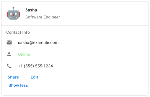 To create the sample
card message in Google Chat, use the following JSON:
To create the sample
card message in Google Chat, use the following JSON:
{ "cardsV2": [ { "cardId": "unique-card-id", "card": {
"header": { "title": "Sasha", "subtitle": "Software Engineer", "imageUrl":
"https://developers.google.com/workspace/chat/images/quickstart-app-avatar.png", "imageType": "CIRCLE",
"imageAltText": "Avatar for Sasha" }, "sections": [ { "header": "Contact Info", "collapsible": true,
"uncollapsibleWidgetsCount": 1, "widgets": [ { "decoratedText": { "startIcon": { "knownIcon": "EMAIL" }, "text":
"sasha@example.com" } }, { "decoratedText": { "startIcon": { "knownIcon": "PERSON" }, "text": "Online" } }, {
"decoratedText": { "startIcon": { "knownIcon": "PHONE" }, "text": "+1 (555) 555-1234" } }, { "buttonList": {
"buttons": [ { "text": "Share", "onClick": { "openLink": { "url": "https://example.com/share" } } }, { "text":
"Edit", "onClick": { "action": { "function": "goToView", "parameters": [ { "key": "viewType", "value": "EDIT" }
] } } } ] } } ] } ] } } ] }
GoogleAppsCardV1CardAction
A card action is the action associated with the card. For example, an invoice card might include actions such as delete invoice, email invoice, or open the invoice in a browser. Google Workspace add-ons:
GoogleAppsCardV1CardFixedFooter
A persistent (sticky) footer that that appears at the bottom of the card. Setting fixedFooter without
specifying a primaryButton or a secondaryButton causes an error. For Chat apps, you can use fixed footers in
dialogs, but not card
messages. For an example in Google Chat
apps, see Add a persistent
footer.
Google Workspace add-ons and Chat apps:
GoogleAppsCardV1CardHeader
Represents a card header. For an example in Google Chat apps, see Add a header. Google Workspace add-ons and Chat apps:
GoogleAppsCardV1Carousel
A carousel, also known as a slider, rotates and displays a list of widgets in a slideshow format, with buttons navigating to the previous or next widget. For example, this is a JSON representation of a carousel that contains three text paragraph widgets.
{ "carouselCards": [ { "widgets": [ { "textParagraph": { "text":
"First text paragraph in carousel", } } ] }, { "widgets": [ { "textParagraph": { "text": "Second text paragraph
in carousel", } } ] }, { "widgets": [ { "textParagraph": { "text": "Third text paragraph in carousel", } } ] } ]
}
GoogleAppsCardV1CarouselCard
A card that can be displayed as a carousel item. Google Chat apps:
GoogleAppsCardV1Chip
A text, icon, or text and icon chip that users can click. Google Workspace add-ons and Chat apps:
GoogleAppsCardV1ChipList
A list of chips layed out horizontally, which can either scroll horizontally or wrap to the next line. Google Workspace add-ons and Chat apps:
GoogleAppsCardV1CollapseControl
Represent an expand and collapse control. Google Workspace add-ons and Chat apps:
GoogleAppsCardV1Column
A column. Google Workspace add-ons and Chat apps
GoogleAppsCardV1Columns
The Columns widget displays up to 2 columns in a card or dialog. You can add widgets to each column; the
widgets appear in the order that they are specified. For an example in Google Chat apps, see Display cards and
dialogs in
columns.
The height of each column is determined by the taller column. For example, if the first column is taller than
the second column, both columns have the height of the first column. Because each column can contain a different
number of widgets, you can't define rows or align widgets between the columns. Columns are displayed
side-by-side. You can customize the width of each column using the HorizontalSizeStyle field. If the user's
screen width is too narrow, the second column wraps below the first: * On web, the second column wraps if the
screen width is less than or equal to 480 pixels. * On iOS devices, the second column wraps if the screen width
is less than or equal to 300 pt. * On Android devices, the second column wraps if the screen width is less than
or equal to 320 dp. To include more than two columns, or to use rows, use the Grid widget. Google Workspace
add-ons and Chat apps: The add-on UIs that support columns
include: * The dialog displayed when users open the add-on from an email draft. * The dialog displayed when
users open the add-on from the Add attachment menu in a Google Calendar event.
GoogleAppsCardV1CommonWidgetAction
Represents an action that is not specific to a widget. Available for Google Workspace add-ons that extend Google Workspace Studio. Unavailable for Google Chat apps.
GoogleAppsCardV1Condition
Represents a condition that can be used to trigger an action. Available for Google Workspace add-ons that extend Google Workspace Studio. Unavailable for Google Chat apps.
GoogleAppsCardV1DataSourceConfig
A configuration object that helps configure the data sources for a widget. Available for Google Chat apps and Google Workspace add-ons that extend Google Workspace Studio.
GoogleAppsCardV1DateTimePicker
Lets users input a date, a time, or both a date and a time. Supports form submission validation. When
Action.all_widgets_are_required is set to true or this widget is specified in Action.required_widgets, the
submission action is blocked unless a value is selected. For an example in Google Chat apps, see Let a user
pick a date and
time.
Users can input text or use the picker to select dates and times. If users input an invalid date or time, the
picker shows an error that prompts users to input the information correctly. Google Workspace add-ons and Chat
apps:
GoogleAppsCardV1DecoratedText
A widget that displays text with optional decorations such as a label above or below the text, an icon in front of the text, a selection widget, or a button after the text. For an example in Google Chat apps, see Display text with decorative text. Google Workspace add-ons and Chat apps:
GoogleAppsCardV1Divider
Displays a divider between widgets as a horizontal line. For an example in Google Chat apps, see Add a horizontal divider between widgets. Google Workspace add-ons and Chat apps: For example, the following JSON creates a divider:
"divider": {}
GoogleAppsCardV1EventAction
Represents an actionthat can be performed on an ui element. Available for Google Workspace add-ons that extend Google Workspace Studio. Unavailable for Google Chat apps.
GoogleAppsCardV1ExpressionData
Represents the data that is used to evaluate an expression. Available for Google Workspace add-ons that extend Google Workspace Studio. Unavailable for Google Chat apps.
GoogleAppsCardV1ExpressionDataCondition
Represents a condition that is evaluated using CEL. Available for Google Workspace add-ons that extend Google Workspace Studio. Unavailable for Google Chat apps.
GoogleAppsCardV1Grid
Displays a grid with a collection of items. Items can only include text or images. For responsive columns, or to
include more than text or images, use Columns. For an example in Google Chat apps, see Display a Grid with a
collection of
items.
A grid supports any number of columns and items. The number of rows is determined by items divided by columns. A
grid with 10 items and 2 columns has 5 rows. A grid with 11 items and 2 columns has 6 rows. Google Workspace
add-ons and Chat apps: For example, the following JSON creates
a 2 column grid with a single item:
"grid": { "title": "A fine collection of items", "columnCount": 2,
"borderStyle": { "type": "STROKE", "cornerRadius": 4 }, "items": [ { "image": { "imageUri":
"https://www.example.com/image.png", "cropStyle": { "type": "SQUARE" }, "borderStyle": { "type": "STROKE" } },
"title": "An item", "textAlignment": "CENTER" } ], "onClick": { "openLink": { "url": "https://www.example.com" }
} }
GoogleAppsCardV1GridItem
Represents an item in a grid layout. Items can contain text, an image, or both text and an image. Google Workspace add-ons and Chat apps:
GoogleAppsCardV1Icon
An icon displayed in a widget on a card. For an example in Google Chat apps, see Add an icon. Supports built-in and custom icons. Google Workspace add-ons and Chat apps:
GoogleAppsCardV1Image
An image that is specified by a URL and can have an onClick action. For an example, see Add an
image. Google Workspace
add-ons and Chat apps:
GoogleAppsCardV1ImageComponent
Represents an image. Google Workspace add-ons and Chat apps:
GoogleAppsCardV1ImageCropStyle
Represents the crop style applied to an image. Google Workspace add-ons and Chat apps: For example, here's how to apply a 16:9 aspect ratio:
cropStyle { "type": "RECTANGLE_CUSTOM", "aspectRatio": 16/9 }
GoogleAppsCardV1MaterialIcon
A Google Material Icon, which includes over 2500+ options. For example, to display a checkbox icon with customized weight and grade, write the following:
{ "name": "check_box", "fill": true, "weight": 300,
"grade": -25 }
GoogleAppsCardV1NestedWidget
A list of widgets that can be displayed in a containing layout, such as a CarouselCard. Google Chat
apps:
GoogleAppsCardV1OnClick
Represents how to respond when users click an interactive element on a card, such as a button. Google Workspace add-ons and Chat apps:
GoogleAppsCardV1OpenLink
Represents an onClick event that opens a hyperlink. Google Workspace add-ons and Chat
apps:
GoogleAppsCardV1OverflowMenu
A widget that presents a pop-up menu with one or more actions that users can invoke. For example, showing
non-primary actions in a card. You can use this widget when actions don't fit in the available space. To use,
specify this widget in the OnClick action of widgets that support it. For example, in a Button. Google
Workspace add-ons and Chat apps:
GoogleAppsCardV1OverflowMenuItem
An option that users can invoke in an overflow menu. Google Workspace add-ons and Chat apps:
GoogleAppsCardV1PlatformDataSource
For a SelectionInput widget that uses a multiselect menu, a data source from Google Workspace. Used to
populate items in a multiselect menu. Google Chat apps:
GoogleAppsCardV1Section
A section contains a collection of widgets that are rendered vertically in the order that they're specified. Google Workspace add-ons and Chat apps:
GoogleAppsCardV1SelectionInput
A widget that creates one or more UI items that users can select. Supports form submission validation for
dropdown and multiselect menus only. When Action.all_widgets_are_required is set to true or this widget
is specified in Action.required_widgets, the submission action is blocked unless a value is selected. For
example, a dropdown menu or checkboxes. You can use this widget to collect data that can be predicted or
enumerated. For an example in Google Chat apps, see Add selectable UI
elements. Chat apps can process the
value of items that users select or input. For details about working with form inputs, see Receive form
data. To collect undefined or abstract data from
users, use the TextInput widget. Google Workspace add-ons and Chat
apps:
GoogleAppsCardV1SelectionItem
An item that users can select in a selection input, such as a checkbox or switch. Supports up to 100 items. Google Workspace add-ons and Chat apps:
GoogleAppsCardV1SuggestionItem
One suggested value that users can enter in a text input field. Google Workspace add-ons and Chat apps:
GoogleAppsCardV1Suggestions
Suggested values that users can enter. These values appear when users click inside the text input field. As
users type, the suggested values dynamically filter to match what the users have typed. For example, a text
input field for programming language might suggest Java, JavaScript, Python, and C++. When users start typing
Jav, the list of suggestions filters to show Java and JavaScript. Suggested values help guide users to
enter values that your app can make sense of. When referring to JavaScript, some users might enter javascript
and others java script. Suggesting JavaScript can standardize how users interact with your app. When
specified, TextInput.type is always SINGLE_LINE, even if it's set to MULTIPLE_LINE. Google Workspace
add-ons and Chat apps:
GoogleAppsCardV1SwitchControl
Either a toggle-style switch or a checkbox inside a decoratedText widget. Google Workspace add-ons and Chat
apps: Only supported in the decoratedText widget.
GoogleAppsCardV1TextInput
A field in which users can enter text. Supports suggestions and on-change actions. Supports form submission
validation. When Action.all_widgets_are_required is set to true or this widget is specified in
Action.required_widgets, the submission action is blocked unless a value is entered. For an example in Google
Chat apps, see Add a field in which a user can enter
text.
Chat apps receive and can process the value of entered text during form input events. For details about working
with form inputs, see Receive form data. When you
need to collect undefined or abstract data from users, use a text input. To collect defined or enumerated data
from users, use the SelectionInput widget. Google Workspace add-ons and Chat
apps:
GoogleAppsCardV1TextParagraph
A paragraph of text that supports formatting. For an example in Google Chat apps, see Add a paragraph of formatted text. For more information about formatting text, see Formatting text in Google Chat apps and Formatting text in Google Workspace add-ons. Google Workspace add-ons and Chat apps:
GoogleAppsCardV1Trigger
Represents a trigger. Available for Google Workspace add-ons that extend Google Workspace Studio. Unavailable for Google Chat apps.
GoogleAppsCardV1UpdateVisibilityAction
Represents an action that updates the visibility of a widget. Available for Google Workspace add-ons that extend Google Workspace Studio. Unavailable for Google Chat apps.
GoogleAppsCardV1Validation
Represents the necessary data for validating the widget it's attached to. Google Workspace add-ons and Chat apps:
GoogleAppsCardV1Widget
Each card is made up of widgets. A widget is a composite object that can represent one of text, images, buttons, and other object types.
GoogleAppsCardV1Widgets
The supported widgets that you can include in a column. Google Workspace add-ons and Chat apps
GoogleChatV1Section
Represents a section in Google Chat. Sections help users
organize their spaces. There are two types of sections: 1. System Sections: These are predefined sections
managed by Google Chat. Their resource names are fixed, and they cannot be created, deleted, or have their
display_name modified. Examples include: * users/{user}/sections/default-direct-messages *
users/{user}/sections/default-spaces * users/{user}/sections/default-apps 2. Custom Sections: These are
sections created and managed by the user. Creating a custom section using CreateSection requires a
display_name. Custom sections can be updated using UpdateSection and deleted using DeleteSection.
Group
A Google Group in Google Chat.
HostAppDataSourceMarkup
A data source from a Google Workspace application. The data source populates available items for a widget.
Image
An image that's specified by a URL and can have an onclick action.
ImageButton
An image button with an onclick action.
Inputs
Types of data that users can input on cards or dialogs. The input type depends on the type of values that the widget accepts.
KeyValue
A UI element contains a key (label) and a value (content). This element can also contain some actions such as
onclick button.
ListCustomEmojisResponse
A response to list custom emojis.
ListMembershipsResponse
Response to list memberships of the space.
ListMessagesResponse
Response message for listing messages.
ListReactionsResponse
Response to a list reactions request.
ListSectionItemsResponse
Response message for listing section items.
ListSectionsResponse
Response message for listing sections.
ListSpaceEventsResponse
Response message for listing space events.
ListSpacesResponse
The response for a list spaces request.
MarkAsActiveRequest
Request message for the MarkAsActive method.
MarkAsAwayRequest
Request message for the MarkAsAway method.
MarkAsDoNotDisturbRequest
Request message for the MarkAsDoNotDisturb method.
MatchedUrl
A matched URL in a Chat message. Chat apps can preview matched URLs. For more information, see Preview links.
Media
Media resource.
MeetSpaceLinkData
Data for Meet space links.
Membership
Represents a membership relation in Google Chat, such as whether a user or Chat app is invited to, part of, or absent from a space.
MembershipBatchCreatedEventData
Event payload for multiple new memberships. Event type: google.workspace.chat.membership.v1.batchCreated
MembershipBatchDeletedEventData
Event payload for multiple deleted memberships. Event type: google.workspace.chat.membership.v1.batchDeleted
MembershipBatchUpdatedEventData
Event payload for multiple updated memberships. Event type: google.workspace.chat.membership.v1.batchUpdated
MembershipCount
Represents the count of memberships of a space, grouped into categories.
MembershipCreatedEventData
Event payload for a new membership. Event type: google.workspace.chat.membership.v1.created.
MembershipDeletedEventData
Event payload for a deleted membership. Event type: google.workspace.chat.membership.v1.deleted
MembershipUpdatedEventData
Event payload for an updated membership. Event type: google.workspace.chat.membership.v1.updated
Message
A message in a Google Chat space.
MessageBatchCreatedEventData
Event payload for multiple new messages. Event type: google.workspace.chat.message.v1.batchCreated
MessageBatchDeletedEventData
Event payload for multiple deleted messages. Event type: google.workspace.chat.message.v1.batchDeleted
MessageBatchUpdatedEventData
Event payload for multiple updated messages. Event type: google.workspace.chat.message.v1.batchUpdated
MessageCreatedEventData
Event payload for a new message. Event type: google.workspace.chat.message.v1.created
MessageDeletedEventData
Event payload for a deleted message. Event type: google.workspace.chat.message.v1.deleted
MessageUpdatedEventData
Event payload for an updated message. Event type: google.workspace.chat.message.v1.updated
MoveSectionItemRequest
Request message for moving a section item across sections.
MoveSectionItemResponse
Response message for moving a section item.
OnClick
An onclick action (for example, open a link).
OpenLink
A link that opens a new window.
PermissionSetting
Represents a space permission setting.
PermissionSettings
Permission settings that you can specify when updating an
existing named space. To set permission settings when creating a space, specify the
PredefinedPermissionSettings field in your request.
PositionSectionRequest
Request message for positioning a section.
PositionSectionResponse
Response message for positioning a section.
Principal
A principal representing an entity granted access.
QuotedMessageMetadata
Information about a message that another message quotes. When you update a message, you can't add or replace the
quotedMessageMetadata field, but you can remove it. For example usage, see Quote another
message.
QuotedMessageSnapshot
Provides a snapshot of the content of the quoted message at the time of quoting or forwarding
Reaction
A reaction to a message.
ReactionBatchCreatedEventData
Event payload for multiple new reactions. Event type: google.workspace.chat.reaction.v1.batchCreated
ReactionBatchDeletedEventData
Event payload for multiple deleted reactions. Event type: google.workspace.chat.reaction.v1.batchDeleted
ReactionCreatedEventData
Event payload for a new reaction. Event type: google.workspace.chat.reaction.v1.created
ReactionDeletedEventData
Event payload for a deleted reaction. Type: google.workspace.chat.reaction.v1.deleted
RichLinkMetadata
A rich link to a resource. Rich links can be associated with the plain-text body of the message or represent
chips that link to Google Workspace resources like Google Docs or Sheets with start_index and length of 0.
SearchSpacesResponse
Response with a list of spaces corresponding to the search spaces request.
Section
A section contains a collection of widgets that are rendered (vertically) in the order that they are specified. Across all platforms, cards have a narrow fixed width, so there's currently no need for layout properties (for example, float).
SectionItem
A user's defined section item. This is used to represent section items, such as spaces, grouped under a section.
SelectionItems
List of widget autocomplete results.
SetUpSpaceRequest
Request to create a space and add specified users to it.
SlashCommand
Metadata about a slash command in Google Chat.
SlashCommandMetadata
Annotation metadata for slash commands (/).
Space
A space in Google Chat. Spaces are conversations between two or more users or 1:1 messages between a user and a Chat app.
SpaceBatchUpdatedEventData
Event payload for multiple updates to a space. Event type: google.workspace.chat.space.v1.batchUpdated
SpaceDataSource
A data source that populates Google Chat spaces as selection items for a multiselect menu. Only populates spaces that the user is a member of. Google Chat apps:
SpaceDetails
Details about the space including description and rules.
SpaceEvent
An event that represents a change or activity in a Google Chat space. To learn more, see Work with events from Google Chat.
SpaceNotificationSetting
The notification setting of a user in a space.
SpaceReadState
A user's read state within a space, used to identify read and unread messages.
SpaceUpdatedEventData
Event payload for an updated space. Event type: google.workspace.chat.space.v1.updated
Status
The Status type defines a logical error model that is suitable for different programming environments,
including REST APIs and RPC APIs. It is used by gRPC. Each Status message contains
three pieces of data: error code, error message, and error details. You can find out more about this error model
and how to work with it in the API Design Guide.
StringInputs
Input parameter for regular widgets. For single-valued widgets, it is a single value list. For multi-valued widgets, such as checkbox, all the values are presented.
TextButton
A button with text and onclick action.
TextParagraph
A paragraph of text. Formatted text supported. For more information about formatting text, see Formatting text in Google Chat apps and Formatting text in Google Workspace Add-ons.
Thread
A thread in a Google Chat space. For example usage, see Start or reply to a message
thread. If you specify a
thread when creating a message, you can set the
messageReplyOption
field to determine what happens if no matching thread is found.
ThreadReadState
A user's read state within a thread, used to identify read and unread messages.
TimeInput
Time input values.
TimeZone
The timezone ID and offset from Coordinated Universal Time (UTC). Only supported for the event types
CARD_CLICKED
and
SUBMIT_DIALOG.
UpdatedWidget
For selectionInput widgets, returns autocomplete suggestions for a multiselect menu.
UploadAttachmentRequest
Request to upload an attachment.
UploadAttachmentResponse
Response of uploading an attachment.
User
A user in Google Chat. When returned as an output from a request, if your Chat app authenticates as a
user, the output for a User
resource only populates the user's name and type.
UserMentionMetadata
Annotation metadata for user mentions (@).
WidgetMarkup
A widget is a UI element that presents text and images.
WorkflowDataSourceMarkup
- Only supported by Google Workspace Workflow, but not Google Chat apps or Google Workspace add-ons. In a
TextInputorSelectionInputwidget with MULTI_SELECT type or aDateTimePicker, provide data source from Google.